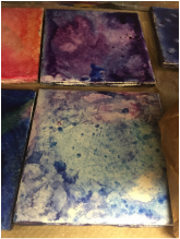
 Some challenges I had to overcome was trying to make the right colors on the tile. When you spread the ink over the tile it would also dry up very quickly which meant you needed to add more alcohol. It was also hard to spread the ink eveningly so that it would cover the whole tile. Since I got tiles for my material, I wanted to make something bright and creative and more abstract. I picked it because I saw other people doing it on Pinterest and I thought it was really neat and I wanted to try. | 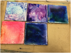 I really like how all the colors and designs turned out! I think how the colors mixed together was pretty successful. If I were to change anything in the future it would be to work a bit quicker so it would not dry up as quick, which means I would use less alcohol and it would dry with the ink quicker, and the ink would not smear. At first, I was going to paint onto each tile and form a bigger picture, but I then decided not to do that because it would might be hard to match up all the edges and make it even. I also had the idea of gluing it together to make it a cube and painting the outside of that. I went on Pinterest to look up some ideas, and I saw people using alcohol and ink to make these cool designs on tiles. I really wanted to try it after seeing all the pictures of how it can turn out. |
|
0 Comments
We created the cranes by using paper and an origami technique to create them! We first made all the cranes with paper, then we all put a hole in the top of the crane and tied a piece of string through. After that was done for all of the cranes, we strung a very long piece of string through the cranes so that we would have about 3 different lines of cranes to hang up. A guy helped us hang these on the lights of the school. We had to make sure the sizing of the string was right and that everything would stay!
From this lesson we learned that you need to plan before you start doing. If we just randomly put this all together it most likely wouldn't have worked and the string wouldn't be long enough or there wouldn't be enough cranes on each string piece. The difference between process and product is that the process is getting to the final product, and the product is the finished piece. Having to create the cranes, put string in them, etc, was the process. Having it completely done and finished is the product.
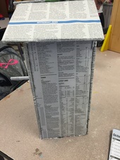
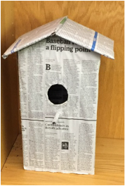
The biggest challenge I had to overcome in my project was the sizing of the cardboard. I had to make sure everything would fit right, and that everything was sized perfectly, so when I went to hot glue, everything would fit. I also had to find certain parts of the newspaper that I thought looked good, and would match the other sides. This is probably my favorite project of the whole semester. I really like how it turned out and how it looks like a real bird house! My mom loves birdhouses so it is already in the kitchen with all the other ones she has collected! If I could change anything I would make the newspaper tighter onto the actual birdhouse itself. As you can tell from the picture, there looks like there is almost an "air bubble" so I would smooth that out and pull it tighter (which I still can do).
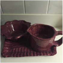
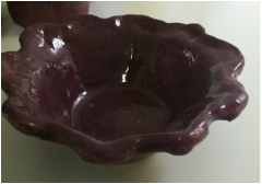
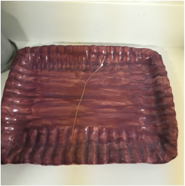
I really ended up liking the process of making my tray and bowl. I found that it was very easy in order to make that shape, since you just have to lay the clay over it. It did tend to stick to it a little bit, but if you wrapped the bowl or tray with paper, it would help it not stick as much. I think in the future I will be using this method, because it makes things a lot quicker and easier! I didn't end up using an underglaze on my pieces, but from looking at other pieces that have used it, I think it turns out really cool! I will be using it in the future! I think overall, my pieces did come out very successful. I ended up liking both of them. They had the exact shape that I wanted and I loved the texture I used on both of them. If I were to change something, I would maybe put a design on the outside of the bowl, or use underglaze on the tray. All my pieces I have made have always been simple, and painted one color, so I think using more colors and designs will look better on any other pieces I will be creating.
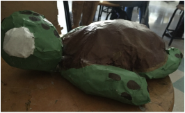
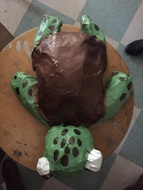
I had to overcome many challenges in this project. First of all, I had to ball up the newspaper to the right size to get somewhat the same form as the turtle. Also, when I was doing the paper mache, sometimes it wouldn't stick to the newspaper. The last challenge I had to overcome was trying to match the paint colors similar to the Turtle , Squirt, in Finding Nemo. Since we don't have the green paint I had to mix many colors to get the right color green that I wanted. I think the colors and the shape ended up being successful; also the overall appearance of it, you can tell that it is a turtle. If I were to go back I would take more time on his arms and legs, and put the brown dots more towards the end. I would probably make his legs not as thick and try to smooth out the newspaper more so that certain areas aren't too rough. Overall, I do like how my project turned out. I would definitely go back and take my time to get the Turtle's features a little more precise.
|
 RSS Feed
